After work on Nycomed’s graphic identity and communication strategy, we started work on the typefaces they had originally asked for.
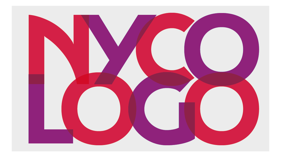
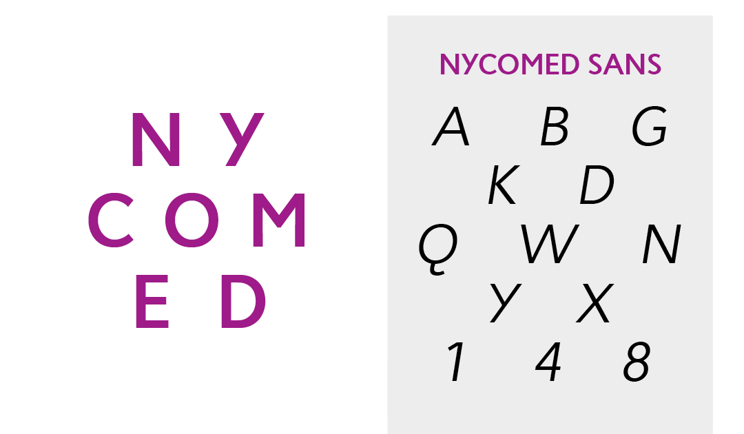
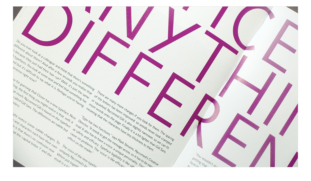
Nycomed Sans was designed to be uniquely Nycomed’s by using elements from the company’s logo. It is clear, legible, and slightly condensed. lt was created in three weights: regular, bold and italic.
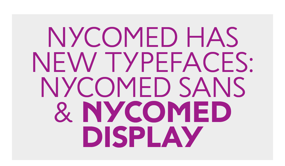

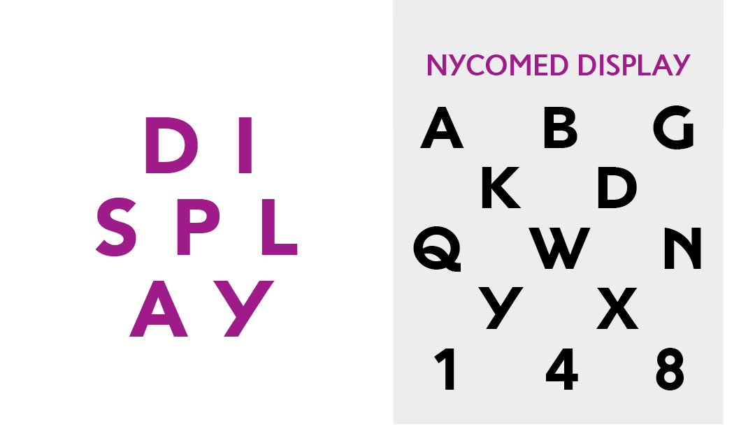
Nycomed Display is also based on the unusual lettering in Nycomed’s logo. We don’t know who drew it, nor what they were thinking, but it was a great starting point for a unique typeface.
