Nycomed was in flux, after mergers and acquisitions. They requested corporate typefaces, but early research showed they had different issues: customers thought Nycomed was a pharma company, shareholders saw it as a marketing business … And the staff were confused. So...
We built on the success of Nycomed’s Stories to create a magazine for their employees and other stakeholders. To help develop a sense of community, we created a high-quality, photography-driven magazine, making Nycomed’s staff known to each other. Other...
After work on Nycomed’s graphic identity and communication strategy, we started work on the typefaces they had originally asked for. Nycomed Sans was designed to be uniquely Nycomed’s by using elements from the company’s logo. It is clear, legible, and...
The European Health Report is a flagship publication from the World Health Organisation Regional Office for Europe. Issued every three years, it presents key trends and progress towards European health policy goals. The report draws on health statistics, technical...
Counter Editions produces limited-edition artworks by leading international contemporary artists. It has become the UK’s leading source for online contemporary art purchases. Counter Editions is primarily an online business. However, research showed that...
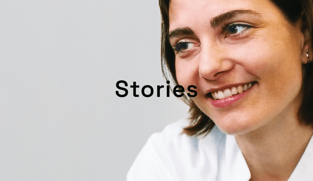 Nycomed was in flux, after mergers and acquisitions. They requested corporate typefaces, but early research showed they had different issues: customers thought Nycomed was a pharma company, shareholders saw it as a marketing business … And the staff were confused. So...
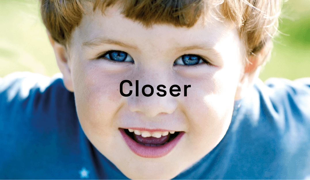 We built on the success of Nycomed’s Stories to create a magazine for their employees and other stakeholders. To help develop a sense of community, we created a high-quality, photography-driven magazine, making Nycomed’s staff known to each other. Other...
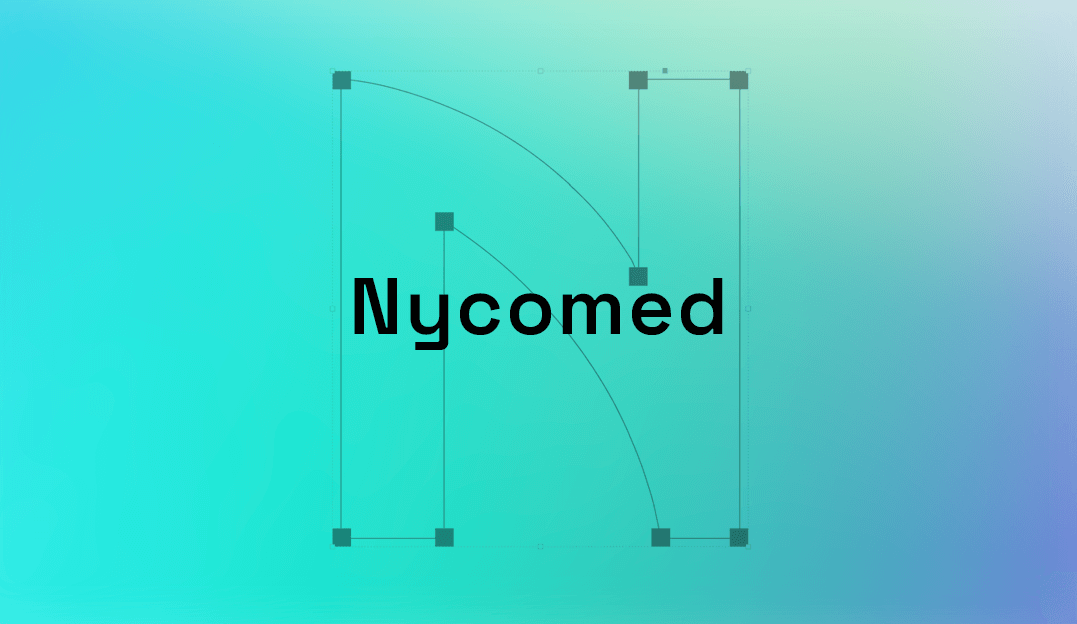 After work on Nycomed’s graphic identity and communication strategy, we started work on the typefaces they had originally asked for. Nycomed Sans was designed to be uniquely Nycomed’s by using elements from the company’s logo. It is clear, legible, and...
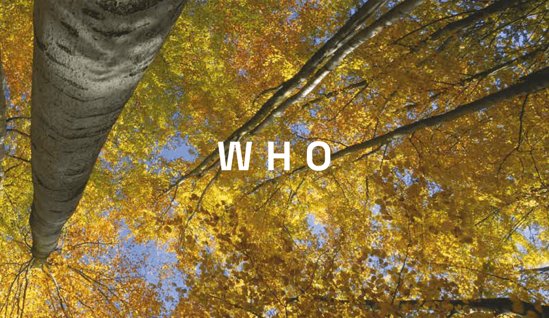 The European Health Report is a flagship publication from the World Health Organisation Regional Office for Europe. Issued every three years, it presents key trends and progress towards European health policy goals. The report draws on health statistics, technical...
 Counter Editions produces limited-edition artworks by leading international contemporary artists. It has become the UK’s leading source for online contemporary art purchases. Counter Editions is primarily an online business. However, research showed that...