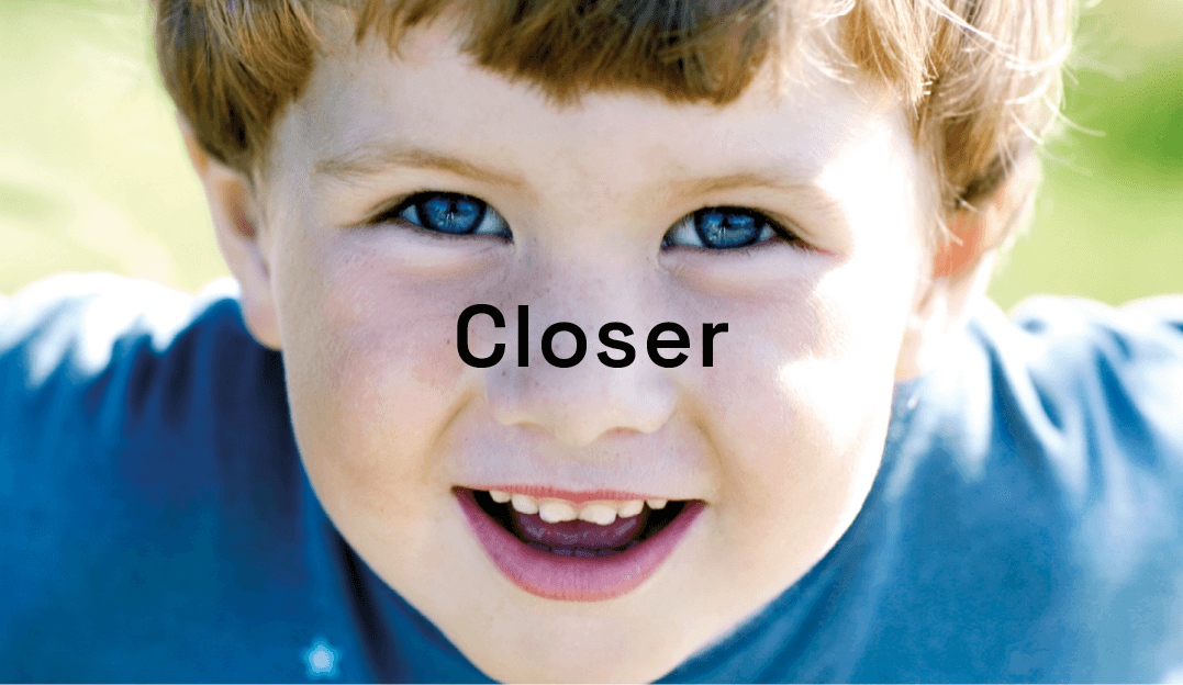
We built on the success of Nycomed’s Stories to create a magazine for their employees and other stakeholders. To help develop a sense of community, we created a high-quality, photography-driven magazine, making Nycomed’s staff known to each other. Other...
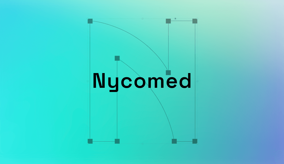
After work on Nycomed’s graphic identity and communication strategy, we started work on the typefaces they had originally asked for. Nycomed Sans was designed to be uniquely Nycomed’s by using elements from the company’s logo. It is clear, legible, and...
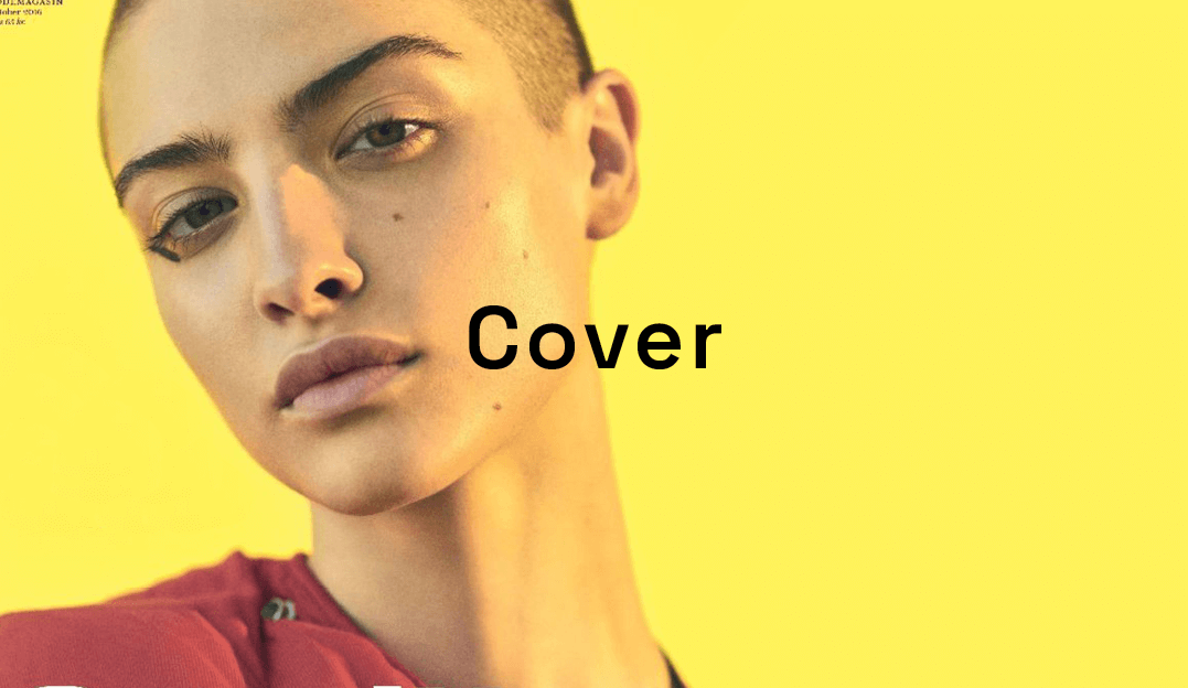
Cover, a Danish lifestyle and fashion magazine, was intended for mass-market appeal, but the brand was perceived as ‘too female’ by men in the target audience. How to change that? We collaborated on a new identity and campaign concepts. We created a fresh...
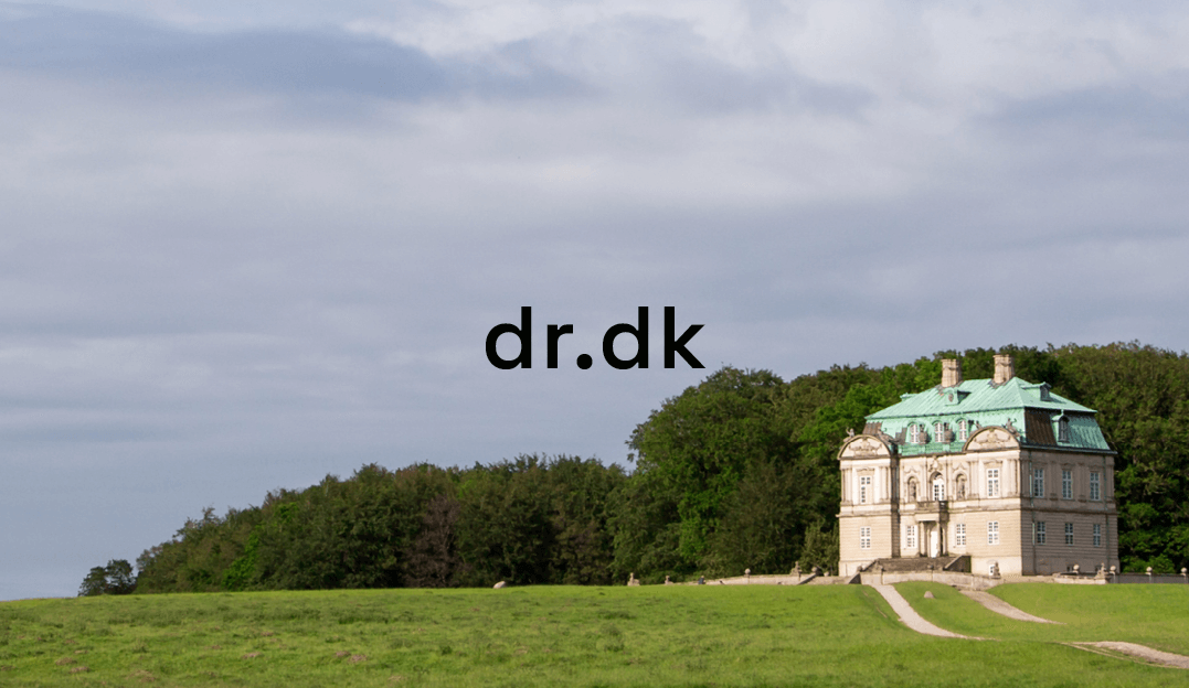
Custom typeface design for Danmarks Radio, the Danish national broadcaster’s second channel. Other...
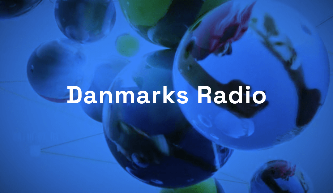
Custom typeface design for Danmarks Radio (the Danish national broadcaster). These letterforms draw on local typographic history to create shapes that are both familiar and modern. Other...
 We built on the success of Nycomed’s Stories to create a magazine for their employees and other stakeholders. To help develop a sense of community, we created a high-quality, photography-driven magazine, making Nycomed’s staff known to each other. Other...
 After work on Nycomed’s graphic identity and communication strategy, we started work on the typefaces they had originally asked for. Nycomed Sans was designed to be uniquely Nycomed’s by using elements from the company’s logo. It is clear, legible, and...
 Cover, a Danish lifestyle and fashion magazine, was intended for mass-market appeal, but the brand was perceived as ‘too female’ by men in the target audience. How to change that? We collaborated on a new identity and campaign concepts. We created a fresh...
 Custom typeface design for Danmarks Radio, the Danish national broadcaster’s second channel. Other...
 Custom typeface design for Danmarks Radio (the Danish national broadcaster). These letterforms draw on local typographic history to create shapes that are both familiar and modern. Other...